 |
|

|
 09-09-2019, 07:18 AM
|
#1
|
|
Human being with feelings
Join Date: Apr 2016
Location: ASU`ogacihC
Posts: 3,921
|
 v5.983+dev0909 - September 9 2019
v5.983+dev0909 - September 9 2019
+ API: add MIDI_GetCCShape, MIDI_SetCCShape
+ FX chain: option to put add/delete buttons above list
# Envelopes: improve drawing of selected envelopes (especially retina/hidpi)
# FX chain: better list size on right side
Full changelog / Latest pre-releases
|

|

|
|
09-09-2019, 08:56 AM
|
#2
|
|
Human being with feelings
Join Date: Jun 2009
Location: South, UK
Posts: 14,218
|
+ FX chain: option to put add/delete buttons above list
thanks! 
__________________
subproject FRs click here
note: don't search for my pseudonym on the web. The "musicbynumbers" you find is not me or the name I use for my own music.
|
|
|
|
|
09-09-2019, 09:48 AM
|
#3
|
|
Human being with feelings
Join Date: Dec 2009
Location: Oblivion
Posts: 10,271
|
Yea, thanks Cockos! Love you guys!
|
|
|
|
|
09-09-2019, 10:08 AM
|
#4
|
|
Human being with feelings
Join Date: Apr 2016
Location: ASU`ogacihC
Posts: 3,921
|
Wouldn't it look better if the buttons were aligned with the other controls?

Win10 x64
|
|
|
|
|
09-09-2019, 10:11 AM
|
#5
|
|
Human being with feelings
Join Date: Oct 2015
Posts: 739
|
A slight suggestion (not FR)... While working on FX chain layout, wouldn't it be great to have folder-like structure for FX Chains? So that there is FX chain name on top of "chain folder", and it is foldable with '+' sign. Something like this:
Code:
AnyEQ
AnyComp
+ MyChain
|   MyEQ
|   MyComp
|   MyNextFX
AnyNextFX
AnyNextEQ
+ My2ndChain
|   MyEQ
|   MyComp
|   MyNextFX
AnyMoreFX
AnyMoreEQ
|
|
|
|
|
09-09-2019, 10:40 AM
|
#6
|
|
Human being with feelings
Join Date: Oct 2013
Location: Argentina
Posts: 1,303
|
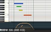
Hi devs, thanks for bringing again selected CCs´drawing to the table. As far as I can see, what I remarked about it in dev0517 is still valid :
https://forum.cockos.com/showpost.ph...68&postcount=2
I see that the border of selected CCs´nodes have the same color as the unselected ones, as shown in the screenshot of the link. Hence, with high levels of zooms, it´s difficult to discern which nodes are selected. Besides, velocity´s horizontal lines are not colored, which would be more consistent too.
|
|
|
|
|
09-09-2019, 11:07 AM
|
#7
|
|
Human being with feelings
Join Date: Dec 2009
Location: Oblivion
Posts: 10,271
|
DPI?
What changed with DPI stuff in recent versions? I use 125% DPI scaling in Win10 and now all elements in Reaper are zoomed, despite any compatibility override settings in Windows. This was working fine in v5.983, but not this dev build.
|
|
|
|
|
09-09-2019, 11:35 AM
|
#8
|
|
Administrator
Join Date: Jan 2005
Location: NYC
Posts: 15,746
|
Quote:
Originally Posted by foxAsteria

What changed with DPI stuff in recent versions? I use 125% DPI scaling in Win10 and now all elements in Reaper are zoomed, despite any compatibility override settings in Windows. This was working fine in v5.983, but not this dev build.
|
The theme UI is zoomed, however if a theme supports 1.25x it will use that layout. The text should look a lot nicer in this mode though (since it is rendered at the native screen resolution).
You can go to prefs/general/advanced, DPI setting, and change this behavior there. It sounds like you previously had set this to "Aware" -- if you don't want REAPER to rescale its UI, try "Aware + ignore".
|
|
|
|
|
09-09-2019, 12:31 PM
|
#9
|
|
Human being with feelings
Join Date: Jul 2009
Posts: 3,295
|
Quote:
Originally Posted by sonicowl
A slight suggestion (not FR)... While working on FX chain layout, wouldn't it be great to have folder-like structure for FX Chains? So that there is FX chain name on top of "chain folder", and it is foldable with '+' sign. Something like this:
Code:
AnyEQ
AnyComp
+ MyChain
|   MyEQ
|   MyComp
|   MyNextFX
AnyNextFX
AnyNextEQ
+ My2ndChain
|   MyEQ
|   MyComp
|   MyNextFX
AnyMoreFX
AnyMoreEQ
|
great suggestion :P
+1
|
|
|
|
|
09-09-2019, 12:52 PM
|
#10
|
|
Human being with feelings
Join Date: Dec 2009
Location: Oblivion
Posts: 10,271
|
Quote:
Originally Posted by Justin
It sounds like you previously had set this to "Aware" -- if you don't want REAPER to rescale its UI, try "Aware + ignore".
|
Indeed I did, and that works. Thanks!
|
|
|
|
|
09-09-2019, 12:55 PM
|
#11
|
|
Human being with feelings
Join Date: Jun 2009
Location: Croatia
Posts: 24,798
|
Quote:
Originally Posted by Edgemeal
Wouldn't it look better if the buttons were aligned with the other controls?
|
Yes, it would. This is what I took extra time to do in my mockup in the previous dev version thread. Please, align things nicely, devs
|
|
|
|
|
09-09-2019, 02:40 PM
|
#12
|
|
Human being with feelings
Join Date: Dec 2016
Posts: 880
|
+ API: add MIDI_GetCCShape, MIDI_SetCCShape
Thanks DEVs, Really appropriate helping us out with the API.
I just spoke to Julian about his CC editing scripts and it looks like these new functions are only for editing individual CCs one at a time. His scripts use the MIDI_Get/SetAllEvts functions, which can edit thousands of CCs in one go. He said the The updated Get/SetAllEvts functions were actually available for a short time when the CC envelopes were first introduced. I'm sure you guys are hard at work making sure everything works correctly before re-releasing that API.
Thank you again.
Last edited by srdmusic; 09-09-2019 at 02:47 PM.
|
|
|
|
|
09-09-2019, 04:25 PM
|
#13
|
|
Human being with feelings
Join Date: Dec 2009
Location: Oblivion
Posts: 10,271
|
Quote:
Originally Posted by EvilDragon
YPlease, align things nicely, devs |
I have to agree. It may seem nitpicky, but to sensitive people, it's actively distracting to the eye.
And to my eye, nothing clutters an interface faster than inconsistent gaps between elements, accompanied by lots of tiny text (which is the Fx Chain Window, in a nutshell,  ).
|
|
|
|
|
09-10-2019, 04:53 AM
|
#14
|
|
Human being with feelings
Join Date: Jun 2018
Posts: 375
|
Quote:
Originally Posted by sonicowl
A slight suggestion (not FR)... While working on FX chain layout, wouldn't it be great to have folder-like structure for FX Chains? So that there is FX chain name on top of "chain folder", and it is foldable with '+' sign. Something like this:
Code:
AnyEQ
AnyComp
+ MyChain
|   MyEQ
|   MyComp
|   MyNextFX
AnyNextFX
AnyNextEQ
+ My2ndChain
|   MyEQ
|   MyComp
|   MyNextFX
AnyMoreFX
AnyMoreEQ
|
Yeah, this would be so nice when working with complex FX chains. I have often wished I could fold them to only take up one slot and work as one unit when moving them around. Pretty much the same reason I fold tracks.
|
|
|
|
|
09-10-2019, 06:30 AM
|
#15
|
|
Human being with feelings
Join Date: Apr 2011
Location: Germany
Posts: 1,186
|
fx chains in folders created in fx browser cannot be renamed.
|
|
|
|
|
09-10-2019, 06:54 AM
|
#16
|
|
Human being with feelings
Join Date: Sep 2018
Location: lugansk
Posts: 153
|
Quote:
Originally Posted by Soli Deo Gloria
Hi devs, thanks for bringing again selected CCs´drawing to the table. As far as I can see, what I remarked about it in dev0517 is still valid :
https://forum.cockos.com/showpost.ph...68&postcount=2
I see that the border of selected CCs´nodes have the same color as the unselected ones, as shown in the screenshot of the link. Hence, with high levels of zooms, it´s difficult to discern which nodes are selected. Besides, velocity´s horizontal lines are not colored, which would be more consistent too. |
Create your midi map)
|
|
|
|
|
09-10-2019, 08:47 AM
|
#17
|
|
Human being with feelings
Join Date: Aug 2015
Posts: 3,672
|
i still think we should have the option to assign 1 color to represent selected data, regardless of what color mode is being used. i use color by track, but want to use a bright, otherwise unused color to represent selection.
just like how all of these words color identically when you click-drag to select them. there's no question as to what is selected, no extra step of thinking "well, this track is X color, so i'm looking for a lighter version of X color"
|
|
|
|
|
09-10-2019, 08:55 AM
|
#18
|
|
Human being with feelings
Join Date: Aug 2006
Location: Berlin
Posts: 11,818
|
Seeing what tracks are selected is an ancient, yet unresolved problem for me. It's no better in the v6 alpha theme ? Haven't checked that for months.
The improvement on the FX chain window work nicely. Alignment? Sure. Can always be done.
|
|
|
|
|
09-10-2019, 04:15 PM
|
#19
|
|
Human being with feelings
Join Date: Jun 2018
Posts: 138
|
Quote:
Originally Posted by foxAsteria
I have to agree. It may seem nitpicky, but to sensitive people, it's actively distracting to the eye.
And to my eye, nothing clutters an interface faster than inconsistent gaps between elements, accompanied by lots of tiny text (which is the Fx Chain Window, in a nutshell, ). |
I don't think it's nitpicky since we're all dealing with aesthetics. I always thought it would be better if things were aligned a little more nicely...
|
|
|
|
|
09-10-2019, 04:53 PM
|
#20
|
|
Human being with feelings
Join Date: Jul 2016
Location: Los Angeles, CA
Posts: 1,701
|
Quote:
Originally Posted by USR
I don't think it's nitpicky since we're all dealing with aesthetics. I always thought it would be better if things were aligned a little more nicely...
|
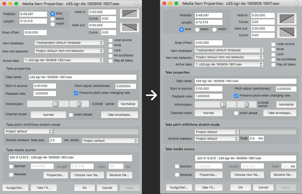
Big +1 for this. The current implementation on the left sends me into an OCD tailspin. Right pic looks SO much better.
|
|
|
|
|
09-10-2019, 05:21 PM
|
#21
|
|
Human being with feelings
Join Date: Dec 2009
Location: Oblivion
Posts: 10,271
|
Yea that's a great example. The image on the left makes my eyes shoot all over and actually produces a feeling of distress. With the one on the right, I can easily find what I'm looking for in one or two smooths sweeps, without any anxiety.
I feel we're getting too far from pre-release concerns here, but yea, Reaper dialogs often feel diving deep for coins. The longer I have to spend looking, the more panicky I get.
|
|
|
|
|
09-10-2019, 11:57 PM
|
#22
|
|
Human being with feelings
Join Date: Aug 2006
Location: Berlin
Posts: 11,818
|
Good grief, that image on the right is better sir.
|
|
|
|
|
09-11-2019, 03:49 AM
|
#23
|
|
Administrator
Join Date: Jan 2005
Location: NYC
Posts: 15,746
|
Quote:
Originally Posted by USR
I don't think it's nitpicky since we're all dealing with aesthetics. I always thought it would be better if things were aligned a little more nicely...
|
Hmm yeah that is nicer
|
|
|
|
|
09-11-2019, 04:39 AM
|
#24
|
|
Human being with feelings
Join Date: Dec 2017
Location: Brazil
Posts: 544
|
Quote:
Originally Posted by USR
I don't think it's nitpicky since we're all dealing with aesthetics. I always thought it would be better if things were aligned a little more nicely...
|
Hi, USR! Congratulations on your idea.
Just like you, I've been asking you for a long time, since 2018, in Preferences to put some words from the main menu in 'bold to highlight'. See the link below.
https://forum.cockos.com/showthread.php?t=210642
PS: I would be grateful to see here how it would look, just like you did for the "Media Item Properties" window, also putting in bold the main topics.
See pic: Bold in areas marked in red
Thanks
Last edited by Edison; 01-09-2020 at 02:47 AM.
|
|
|
|
|
09-11-2019, 06:37 AM
|
#25
|
|
Human being with feelings
Join Date: Aug 2014
Location: Dallas, TX
Posts: 90
|
Quote:
Originally Posted by USR
I don't think it's nitpicky since we're all dealing with aesthetics. I always thought it would be better if things were aligned a little more nicely...
|
+1000 for this! This is sooooo much nicer! Great mock-up.
|
|
|
|
|
09-11-2019, 06:52 AM
|
#26
|
|
Human being with feelings
Join Date: Mar 2019
Posts: 885
|
Quote:
Originally Posted by USR
I don't think it's nitpicky since we're all dealing with aesthetics. I always thought it would be better if things were aligned a little more nicely...
|
yeah agreed, very nice!
schematic design is an art-form, probably I would even go this far :

|
|
|
|
|
09-11-2019, 07:59 AM
|
#27
|
|
Human being with feelings
Join Date: Jan 2011
Location: Tokyo
Posts: 319
|
Hello, it is definitely better when aligned. I even wonder why I didn't realize it wasn't before.
|
|
|
|
|
09-11-2019, 09:46 AM
|
#28
|
|
Human being with feelings
Join Date: Dec 2009
Location: Oblivion
Posts: 10,271
|
Quote:
Originally Posted by PhelixK
schematic design is an art-form, probably I would even go this
|
Yea. Good UI design is a bit undervalued these days, just like most other kinds of art. Definitely takes a skilled hand.
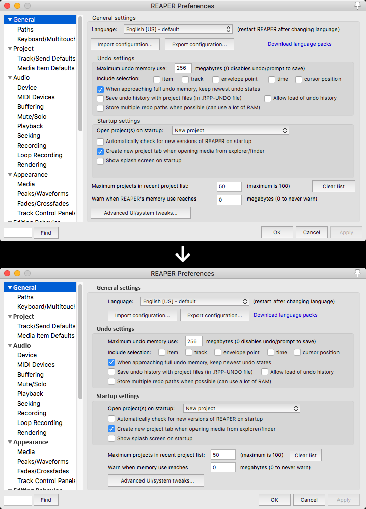
I would go even further and make each section a collapsible panel for a less overwhelming experience. E.g. in the item properties window, 99/100 times I only want to see take properties, but still end up reading half that text every time I open the dialog.
Preferences sections actually are collapsible, but unfortunately they don't stay collapsed after closing the window...
Not a mockup: 
I think noobs would do a lot less complaining about the interface if all the really powerful tools were under the hood.
|
|
|
|
|
09-11-2019, 10:03 AM
|
#29
|
|
Human being with feelings
Join Date: Nov 2014
Posts: 798
|
The varied tone mockup doe make it easier to read imo
|
|
|
|
|
09-11-2019, 10:09 AM
|
#30
|
|
Human being with feelings
Join Date: Dec 2017
Location: Brazil
Posts: 544
|
Quote:
Originally Posted by PhelixK
yeah agreed, very nice!
– schematic design is an art-form, probably I would even go this far :
|
Great, PhelixK!!
My dreams come true!
Yeahhhh!!! REAPER...Constant Evolution!
Last edited by Edison; 09-11-2019 at 12:04 PM.
|
|
|
|
|
09-11-2019, 10:33 AM
|
#31
|
|
Human being with feelings
Join Date: Dec 2017
Location: Brazil
Posts: 544
|
Quote:
Originally Posted by foxAsteria
Yea. Good UI design is a bit undervalued these days, just like most other kinds of art. Definitely takes a skilled hand.
I would go even further and make each section a collapsible panel for a less overwhelming experience. E.g. in the item properties window, 99/100 times I only want to see take properties, but still end up reading half that text every time I open the dialog.
Preferences sections actually are collapsible, but unfortunately they don't stay collapsed after closing the window...
Not a mockup:
I think noobs would do a lot less complaining about the interface if all the really powerful tools were under the hood. |
Yes...foxAsteria
But I would still like to see the 'Main Knob' of each topic as Bold to highlight, in this case 'Audio'!
As I've been suggesting since 2018 for: General, Project, Audio, Appearance, Editing Behavior, Media, Plug-ins, Control/OSC/web and External Editors.
Last edited by Edison; 09-11-2019 at 10:45 AM.
|
|
|
|
|
09-11-2019, 12:29 PM
|
#32
|
|
Human being with feelings
Join Date: Mar 2019
Posts: 885
|
Quote:
Originally Posted by foxAsteria
Yea. Good UI design is a bit undervalued these days, just like most other kinds of art. Definitely takes a skilled hand.
I would go even further and make each section a collapsible panel for a less overwhelming experience. E.g. in the item properties window, 99/100 times I only want to see take properties, but still end up reading half that text every time I open the dialog.
Preferences sections actually are collapsible, but unfortunately they don't stay collapsed after closing the window...
Not a mockup:
I think noobs would do a lot less complaining about the interface if all the really powerful tools were under the hood. |
Not a mockup -sorry, where is this picture taken from?
Anyways, youre right, and I never thought of that as a bug, but I do now:-) Of cause it should stay collapsed or in same state, at least within same session. Media explorer do keep and recall last view.
I agree, having collapsible sections within windows could bring the entire UI a huge step further towards a more gentle experience for newcomers. But it has to be done in a smart, discrete way, not becoming a burden for elite users. Features like dynamic windows comes into mind.
Also to begin with, the top main menu can be quite overwhelming, I mean, ask someone relatively new to Reaper to find sub menu for Items Ruler..
On the other hand, the more complex, the greater chance for everyone, skilled or not, to learn something new each time we open up Reaper ツ
|
|
|
|
|
09-11-2019, 02:05 PM
|
#33
|
|
Human being with feelings
Join Date: Oct 2015
Posts: 739
|
Quote:
Originally Posted by foxAsteria
Not a mockup:
. |
System like this would look great also for FX Chain folding. FX Chain would be like a folder, collapsible, so you can hide complex FX chains and not have them taking space.
|
|
|
|
|
09-11-2019, 05:48 PM
|
#34
|
|
Human being with feelings
Join Date: Dec 2009
Location: Oblivion
Posts: 10,271
|
Quote:
Originally Posted by PhelixK
Not a mockup -sorry, where is this picture taken from?
|
I just snipped Reaper preferences with most of the headers collapsed.
Quote:
Originally Posted by Edison
But I would still like to see the 'Main Knob' of each topic as Bold to highlight
|
Yea, bold or even ALL CAPS.
|
|
|
|
|
09-11-2019, 06:31 PM
|
#35
|
|
Human being with feelings
Join Date: Jun 2014
Location: Ohio
Posts: 981
|
Quote:
Originally Posted by USR
I don't think it's nitpicky since we're all dealing with aesthetics. I always thought it would be better if things were aligned a little more nicely...
|
Not nitpicky at all. I love it!
|
|
|
|
|
09-14-2019, 05:32 AM
|
#36
|
|
Human being with feelings
Join Date: Dec 2017
Location: Quebec, Canada
Posts: 550
|
To dive in, I also agree with the idea proposed originally by USR.
It looks very reasonnable to do and also looks much more easy to look through the options
|
|
|
|
|
09-16-2019, 08:47 AM
|
#37
|
|
Human being with feelings
Join Date: Jun 2018
Posts: 138
|
Quote:
Originally Posted by Edison
I would be grateful to see here how it would look, just like you did for the "Media Item Properties" window, also putting in bold the main topics.
|
And I would organize things a little bit, maybe like this...
|
|
|
|
|
09-16-2019, 12:10 PM
|
#38
|
|
Human being with feelings
Join Date: Dec 2017
Location: Brazil
Posts: 544
|
Quote:
Originally Posted by USR
And I would organize things a little bit, maybe like this...
|
USR, Great!!
I liked very much the way shown below, it would only leave in darker gray the areas marked in red, such as the windows of Media Item Properties also marked.
What do you think? See the pics.
Last edited by Edison; 01-09-2020 at 02:47 AM.
|
|
|
|
|
11-25-2021, 06:36 AM
|
#39
|
|
Human being with feelings
Join Date: Jun 2019
Posts: 2,875
|
Quote:
Originally Posted by USR
|
I am wondering if it would take a lot of work and effort to redesign a window like this. Reaper is so powerful because of its many features, preferences and options, but often it can be hard to find them because they are scattered around in windows with chaotic layouts. Having to "read" the window option by option can take time, be straining and decrease productivity. Not to say that such windows look needlessly intimidating to new users and discourage exploration.
I really believe that it would be worth the effort to once in a while just take such a window, go through the layout and make sure everything is properly aligned, grouped in meaningful sections and looking tidy.
Also when adding new UI elements to existing windows,I believe that care should be taken right away about their size, position and alignment and if necessary existing elements should be resized and moved to accommodate the new element.
I am sure that in the long run such extra work would be beneficial to make Reaper not just easier to learn for new users but also quicker and more enjoyable to use for experienced users. It already is the best DAW in terms of power, efficiency and customizability and it would be great if a little more care would go into UI layout so that this aspect doesn't have to be its Achilles' heel anymore.
Still, a big thank you to the devs for the great work you keep delivering. Keep it up!
|
|
|
|
|
11-25-2021, 07:01 AM
|
#40
|
|
Human being with feelings
Join Date: Jul 2010
Location: Slovakia
Posts: 2,588
|
Long story short - UX.
|
|
|
|
| Thread Tools |
|
|
| Display Modes |
 Linear Mode Linear Mode
|
 Posting Rules
|
You may not post new threads
You may not post replies
You may not post attachments
You may not edit your posts
HTML code is Off
|
|
|
All times are GMT -7. The time now is 12:40 AM.
|


