 |
|

|
 12-23-2019, 03:34 AM
|
#161
|
|
Human being with feelings
Join Date: Jan 2019
Location: UK
Posts: 938
|
Softer and smaller chisels in this version. Loving this one...
 Full screen 4K shot here.
|

|

|
|
12-23-2019, 03:39 AM
|
#162
|
|
Human being with feelings
Join Date: Jan 2019
Location: UK
Posts: 938
|
Quote:
Originally Posted by +NRG

Simply astounding! How long have you been working on this?
|
Thanks.
Just under a week, 'full time', as such. A lot of hours crammed in :¬)
Last edited by b0se; 12-23-2019 at 03:52 AM.
|
|
|
|
|
12-23-2019, 03:57 AM
|
#163
|
|
Human being with feelings
Join Date: Mar 2019
Posts: 885
|
Quote:
Originally Posted by synkrotron
This image show the importance of getting those pink lines right:-
|
Indeed, 254 0 255 isnt Reaper pink 
For the interested, heres a good read and overview of using pink and yellow png encodings,
WT_Power-of-Pink by WhiteTie, 2008: stash.reaper.fm/4191/WT_Power-of-Pink.pdf
photoshop is also well suited for this task.
|
|
|
|
|
12-23-2019, 04:30 AM
|
#164
|
|
Human being with feelings
Join Date: Jan 2019
Location: UK
Posts: 938
|
Quote:
Originally Posted by PhelixK
Indeed, 254 0 255 isn’t ‘Reaper pink’
For the interested, here’s a good read and overview of using pink and yellow png encodings,
WT_Power-of-Pink by WhiteTie, 2008: stash.reaper.fm/4191/WT_Power-of-Pink.pdf
– photoshop is also well suited for this task. |
Thanks for sharing.
It's all fine now I have the correct pink saved as a palette (thank Andy), but before then I had a very strange bug - I would enter 255 0 255 manually and it would have different HSB and LAB values to the existing PNGs in Reaper. If I put the correct LAB values in it would flip to 254. I used to theme Windows XP, I know that pink very well 
I have rebooted since, perhaps there was a PS glitch.
Theme update - perfected the TCP folder corners (compare to the image above). They now match the borders and chisel line:
These are the little touches that take the most time.
Huge thanks to those that have helped me, progress would have been a lot slower :¬)
|
|
|
|
|
12-23-2019, 04:34 AM
|
#165
|
|
Human being with feelings
Join Date: Feb 2017
Posts: 34
|
Holy moly this looks to become the number one most beautiful Reaper theme of all time! You are a truly talented person to be able to do this in just a week!
You sir, have just made my new default theme!
|
|
|
|
|
12-23-2019, 04:44 AM
|
#166
|
|
Human being with feelings
Join Date: Jan 2019
Location: UK
Posts: 938
|
I've yet to come across these icons:

Anyone know where to find them? Need to see how they fit in (or not) :¬)
Edit: MIDI editor for the transport controls. Happy with those for now.
|
|
|
|
|
12-23-2019, 04:45 AM
|
#167
|
|
Human being with feelings
Join Date: Jan 2019
Location: UK
Posts: 938
|
Quote:
Originally Posted by JoostJanssensDS
Holy moly this looks to become the number one most beautiful Reaper theme of all time! You are a truly talented person to be able to do this in just a week!
You sir, have just made my new default theme!
|
Thank you :¬)
It's HiDPI/Retina only atm. It will be converted to standard res after Christmas.
|
|
|
|
|
12-23-2019, 05:23 AM
|
#168
|
|
Human being with feelings
Join Date: Jan 2019
Location: UK
Posts: 938
|
Who am I kidding - made new MIDI keys. Prefer a bright colourmap too...

|
|
|
|
|
12-23-2019, 05:33 AM
|
#169
|
|
Human being with feelings
Join Date: Feb 2017
Posts: 34
|
Quote:
Originally Posted by b0se
Thank you :¬)
It's HiDPI/Retina only atm. It will be converted to standard res after Christmas.
|
Well luckily I am on a 4K screen so this is perfect!
|
|
|
|
|
12-23-2019, 06:30 AM
|
#170
|
|
Human being with feelings
Join Date: Jan 2019
Location: UK
Posts: 938
|
TCP alternate version complete! It'll be included as a track style variation.
It's even better in use, the screenshot doesn't do it justice. Close up:
|
|
|
|
|
12-23-2019, 06:33 AM
|
#171
|
|
Human being with feelings
Join Date: Jul 2006
Location: Paris, France
Posts: 499
|
💙💚💛💜🧡
|
|
|
|
|
12-23-2019, 06:35 AM
|
#172
|
|
Human being with feelings
Join Date: Jan 2019
Location: UK
Posts: 938
|
|
|
|
|
|
12-23-2019, 07:03 AM
|
#173
|
|
Human being with feelings
Join Date: Oct 2017
Location: Black Forest
Posts: 5,066
|
Quote:
Originally Posted by b0se
I've yet to come across these icons:
Anyone know where to find them? Need to see how they fit in (or not) :¬)
Edit: MIDI editor for the transport controls. Happy with those for now. |
The MIDI port icons are from the routing dialog.
And I would guess the play button is from the media explorer?
|
|
|
|
|
12-23-2019, 07:05 AM
|
#174
|
|
Human being with feelings
Join Date: Aug 2014
Location: NY
Posts: 791
|
That looks great too!
__________________
Where words fail, music speaks
|
|
|
|
|
12-23-2019, 07:05 AM
|
#175
|
|
Human being with feelings
Join Date: Mar 2016
Posts: 58
|
Woooooowwww... I love that alternate TCP. I've dreamed of something like that for quite some time. Haven't had the time nor the skills to do it though.
Seriously incredible work b0se! I have been refreshing this thread every 15 mins since your first post, I can not wait to replace my themes with this one.
Where can I donate some money in appreciation of your time and work?
|
|
|
|
|
12-23-2019, 07:34 AM
|
#176
|
|
Human being with feelings
Join Date: Jan 2019
Location: UK
Posts: 938
|
Quote:
Originally Posted by _Stevie_
The MIDI port icons are from the routing dialog.
And I would guess the play button is from the media explorer?
|
Ah yes, thanks! These are all next in line.
Quote:
Originally Posted by +NRG
That looks great too!
|
Cheers.
Quote:
Originally Posted by glymur
Woooooowwww... I love that alternate TCP. I've dreamed of something like that for quite some time. Haven't had the time nor the skills to do it though.
Seriously incredible work b0se! I have been refreshing this thread every 15 mins since your first post, I can not wait to replace my themes with this one.
Where can I donate some money in appreciation of your time and work?
|
Thank you!
If anyone wishes to donate I'll share a PayPal link :¬)
|
|
|
|
|
12-23-2019, 07:50 AM
|
#177
|
|
Human being with feelings
Join Date: Jun 2009
Location: France_var
Posts: 416
|
Hi, very nice theme. I missed beta's link !?
|
|
|
|
|
12-23-2019, 08:02 AM
|
#178
|
|
Human being with feelings
Join Date: Jan 2019
Location: UK
Posts: 938
|
Quote:
Originally Posted by otsoa
Hi, very nice theme. I missed beta's link !?
|
Beta isn't out yet, it'll be tonight or tomorrow depending on the work/tweaks I can finish today.
When I say beta, I mean V1 really, as it's becoming quite a complete theme.
|
|
|
|
|
12-23-2019, 08:07 AM
|
#179
|
|
Human being with feelings
Join Date: Jun 2009
Location: France_var
Posts: 416
|
Ok, GJ !
|
|
|
|
|
12-23-2019, 08:34 AM
|
#180
|
|
Human being with feelings
Join Date: Jul 2007
Location: New Joisey
Posts: 6,022
|
b0se, would it be possible to nudge the time selection a bit off that left margin and maybe frame the time selection and actual time display fields inside a box/window/frame (not sure what the right word is)? Like how "Default 4.0" puts them in [ornamental] boxes versus having text just superimposed on the background. I think it just helps frame the text and looks better. Not a deal breaker by any means, but just a thought to spice up the transport section.
|
|
|
|
|
12-23-2019, 09:21 AM
|
#181
|
|
Human being with feelings
Join Date: Jan 2019
Location: UK
Posts: 938
|
Quote:
Originally Posted by Funkybot
b0se, would it be possible to nudge the time selection a bit off that left margin and maybe frame the time selection and actual time display fields inside a box/window/frame (not sure what the right word is)? Like how "Default 4.0" puts them in [ornamental] boxes versus having text just superimposed on the background. I think it just helps frame the text and looks better. Not a deal breaker by any means, but just a thought to spice up the transport section.
|
Yeah that's to be changed. I'm leaving the status bar flat though, I like it that way. I don't want the design of the bar to clash or take the eye away from the elements it contains.
I may consider it at a later date once people have shared screenshots of their layouts and whatnot.
|
|
|
|
|
12-23-2019, 09:35 AM
|
#182
|
|
Human being with feelings
Join Date: Aug 2019
Posts: 855
|
This is looking great Bose! Is is still working with the theme adjuster, or have you had to abandon that functionality? Any plans for alternate mixer layouts with alternate fader colours?
Last edited by Joe90; 12-23-2019 at 09:35 AM.
Reason: spelling
|
|
|
|
|
12-23-2019, 09:37 AM
|
#183
|
|
Human being with feelings
Join Date: Jan 2019
Location: UK
Posts: 938
|
Quote:
Originally Posted by Joe90
This is looking great Bose! Is is still working with the theme adjuster, or have you had to abandon that functionality? Any plans for alternate mixer layouts with alternate fader colours?
|
Cheers. Yes fully compatible with the theme adjuster. I've made a point to stay within the default V6 theme boundaries and designed around that.
I've always found coloured faders a bit tacky. I may add them to a later release if the demand is high, post V1/beta.
|
|
|
|
|
12-23-2019, 09:44 AM
|
#184
|
|
Human being with feelings
Join Date: Jan 2019
Location: UK
Posts: 938
|
Quote:
Originally Posted by Joe90
This is looking great Bose! Is is still working with the theme adjuster, or have you had to abandon that functionality? Any plans for alternate mixer layouts with alternate fader colours?
|
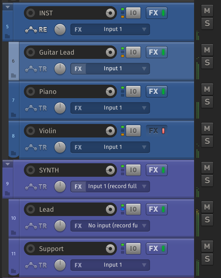
Having said that, I designed them so they could be coloured easily.
Example:

|
|
|
|
|
12-23-2019, 09:45 AM
|
#185
|
|
Human being with feelings
Join Date: Jan 2019
Location: UK
Posts: 938
|
Hmmm. I like it more than I thought. They'll be added after the first release. Hat = eaten.
|
|
|
|
|
12-23-2019, 09:47 AM
|
#186
|
|
Human being with feelings
Join Date: Aug 2019
Posts: 855
|

Quote:
Originally Posted by b0se
Cheers. Yes fully compatible with the theme adjuster. I've made a point to stay within the default V6 theme boundaries and designed around that.
|
Awesome, nicely done.
Quote:
Originally Posted by b0se
I've always found coloured faders a bit tacky. I may add them to a later release if the demand is high, post V1/beta.
|
Fair enough. I'm a cubase convert and I use tinted faders/TCP controls in the mixer to very quickly differentiate between folders (blue), VSTi tracks (green) FX sends (Red) and everything else. I have the mixer on the second screen, a typical project size is 100-200 tracks and I haven't found a quicker way of quickly making this distinction. If your workflow is based around the pinned one track mixer on the left of the TCP then I can understand why this would absolutely feel like unnecessary gloss, but I'd struggle without it.
Anyway, please don't feel obliged on my behalf... once you put it out there and I know if it's clicking with me, then I can just tacky it up myself by copying the main layout a few times and recolouring the faders/tcp controls
|
|
|
|
|
12-23-2019, 09:49 AM
|
#187
|
|
Human being with feelings
Join Date: Jan 2019
Location: UK
Posts: 938
|
Quote:
Originally Posted by Joe90
Awesome, nicely done.
Fair enough. I'm a cubase convert and I use tinted faders/TCP controls in the mixer to very quickly differentiate between folders (blue), VSTi tracks (green) FX sends (Red) and everything else. I have the mixer on the second screen, a typical project size is 100-200 tracks and I haven't found a quicker way of quickly making this distinction. If your workflow is based around the pinned one track mixer on the left of the TCP then I can understand why this would absolutely feel like unnecessary gloss, but I'd struggle without it.
Anyway, please don't feel obliged on my behalf... once you put it out there and I know if it's clicking with me, then I can just tacky it up myself by copying the main layout a few times and recolouring the faders/tcp controls |
Check the above post
|
|
|
|
|
12-23-2019, 10:01 AM
|
#188
|
|
Human being with feelings
Join Date: Aug 2019
Posts: 855
|
Very nice! You've actually managed to do it tastefully.
Have you tried lightly tinting the mcp_fxparm_knob_stack.png on those layouts with same colour you are tinting the fader? If you don't use the FX parameters in the mixer then obviously it makes no difference, but if you do, and you have a couple of parameters connected to your main channel EQ that loads with your default track like I do (so all the FX parameter controls are nicely lined up on the mixer) then it just helps them pop out that tiny bit more, especially when actual track colour is different to the fader layout colour (which it often would be in my use case).
Again, easily done ourselves, but you should give it a try as you might like the look.
|
|
|
|
|
12-23-2019, 10:13 AM
|
#189
|
|
Human being with feelings
Join Date: Jan 2019
Location: UK
Posts: 938
|
Quote:
Originally Posted by Joe90
Very nice! You've actually managed to do it tastefully.
Have you tried lightly tinting the mcp_fxparm_knob_stack.png on those layouts with same colour you are tinting the fader? If you don't use the FX parameters in the mixer then obviously it makes no difference, but if you do, and you have a couple of parameters connected to your main channel EQ that loads with your default track like I do (so all the FX parameter controls are nicely lined up on the mixer) then it just helps them pop out that tiny bit more, especially when actual track colour is different to the fader layout colour (which it often would be in my use case).
Again, easily done ourselves, but you should give it a try as you might like the look.
|
Firstly, I have no idea how to tint anything with the current track colour :¬) How does one do that?
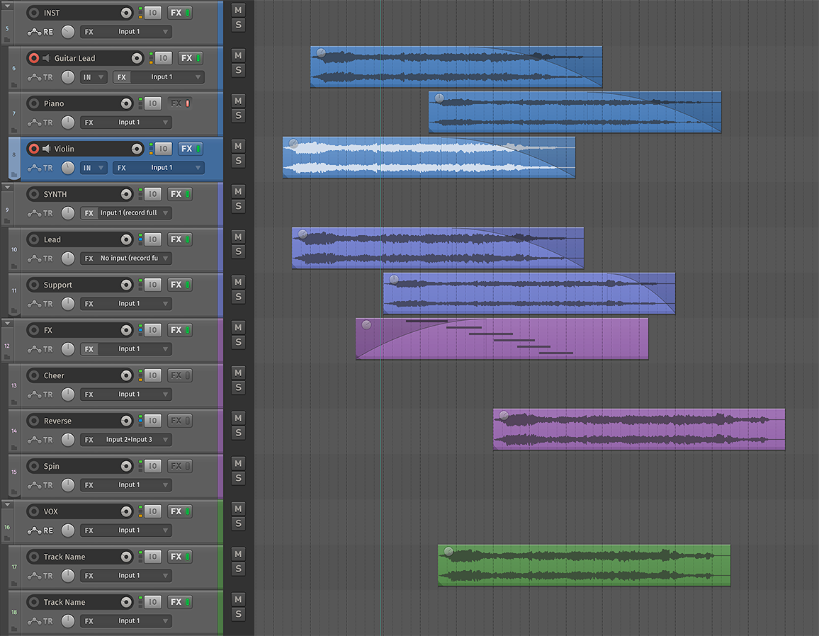
Secondlyif you're talking of how it looks on the TCPI don't think it's necessary as I made the stack BG transparent:

The center dot and the stack match the other 'touchable' UI elements design-wise, and the background serves as the colouring tool.
Unless I'm misunderstanding you, of course. Do you mean the FX list stack (for sends)?
|
|
|
|
|
12-23-2019, 10:15 AM
|
#190
|
|
Human being with feelings
Join Date: Jan 2019
Location: UK
Posts: 938
|
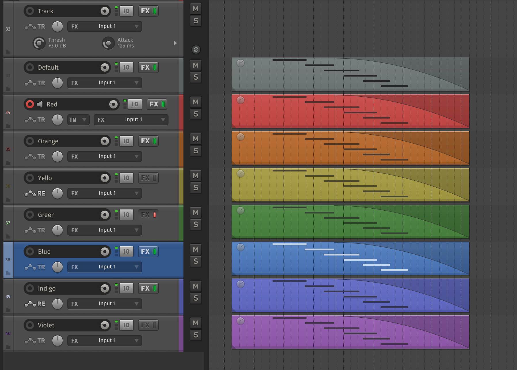
Alternative TCP track ID now all grey. Much nicer...

|
|
|
|
|
12-23-2019, 10:25 AM
|
#191
|
|
Human being with feelings
Join Date: Jul 2007
Location: New Joisey
Posts: 6,022
|
Quote:
Originally Posted by b0se
Having said that, I designed them so they could be coloured easily.
|
Those look great. I think you cracked the code to colorizing fader caps: don't do the whole thing, but design the fader caps with a section that's meant to be easily colorized and still look good.
One more suggestion: I prefer faders that have a horizontal center line. Just visually helps see unity gain. You have a horizontal mark on the mcp background itself just nothing to line it up on the fader. If you think that makes sense and could be worked in, might be a nice small touch to add.
|
|
|
|
|
12-23-2019, 11:01 AM
|
#192
|
|
Human being with feelings
Join Date: Jan 2019
Location: UK
Posts: 938
|
Quote:
Originally Posted by Funkybot
Those look great. I think you cracked the code to colorizing fader caps: don't do the whole thing, but design the fader caps with a section that's meant to be easily colorized and still look good.
One more suggestion: I prefer faders that have a horizontal center line. Just visually helps see unity gain. You have a horizontal mark on the mcp background itself just nothing to line it up on the fader. If you think that makes sense and could be worked in, might be a nice small touch to add.
|
Indeed - cheers.
Why not double click if resetting to zero?
|
|
|
|
|
12-23-2019, 11:06 AM
|
#193
|
|
Human being with feelings
Join Date: Jan 2019
Location: UK
Posts: 938
|
Global envelope skinned. Default (off - same state for trim):

Active (read, latch, preview, write):

Going to bump it up 1px later.
Selection text also pushed in for left margin FunkyBot.
|
|
|
|
|
12-23-2019, 11:08 AM
|
#194
|
|
Human being with feelings
Join Date: Jul 2007
Location: New Joisey
Posts: 6,022
|
Quote:
Originally Posted by b0se
Indeed - cheers.
Why not double click if resetting to zero?
|
Indeed I could. But it's just another visual cue when quickly scanning the channels of the mixer. Not looking to tweak anything just yet but just want to make sure everything looks lined up. But more than anything, I've probably just grown accustomed to seeing it from my current Reaper theme (iLogic v3), and even other DAWs I've used before like Cubase, Sonar and Studio One which all also just have a center line on the fader cap.
|
|
|
|
|
12-23-2019, 11:11 AM
|
#195
|
|
Human being with feelings
Join Date: Aug 2014
Location: NY
Posts: 791
|
Wow, you work fast!
The TCP volume knob position indicator line seems very subtle to me.
Im enjoying the real-time updates and images as you work!
__________________
Where words fail, music speaks
|
|
|
|
|
12-23-2019, 11:24 AM
|
#196
|
|
Human being with feelings
Join Date: Jul 2018
Location: Canada
Posts: 172
|
Really looking forward to this one. There are only a handful of themes that really feel professional and Smooth is one of them. It's Lando Calrissian smooth.
I have not read all the thread but will the toolbar icons also be reworked? It would seem fitting to have them also be monochrome.
|
|
|
|
|
12-23-2019, 11:34 AM
|
#197
|
|
Human being with feelings
Join Date: Jan 2019
Location: UK
Posts: 938
|
Quote:
Originally Posted by Funkybot
Indeed I could. But it's just another visual cue when quickly scanning the channels of the mixer. Not looking to tweak anything just yet but just want to make sure everything looks lined up. But more than anything, I've probably just grown accustomed to seeing it from my current Reaper theme (iLogic v3), and even other DAWs I've used before like Cubase, Sonar and Studio One which all also just have a center line on the fader cap.
|
I'll think about it, happy with the sliders atm, but I may be able to employ a faint dark line on the black areas of the slider. No promises though :¬)
Quote:
Originally Posted by +NRG
Wow, you work fast!
The TCP volume knob position indicator line seems very subtle to me.
I’m enjoying the real-time updates and images as you work!
|
Yes, I asked White Tie about that - it uses the Reaper in-built line (meaning no stack has to be done). Unfortunately it can only be 1px thick, even in HiDPI mode. 3px would have been perfect.
You can work around it by creating a 'stack' (a graphic for every dial position), but I really don't have the time for that. I'm already giving all of my time for this theme, creating stacks just isn't going to happen.
Maybe if we're lucky someone can jump in and help.
Quote:
Originally Posted by Herr Nox
Really looking forward to this one. There are only a handful of themes that really feel professional and Smooth is one of them. It's Lando Calrissian smooth.
I have not read all the thread but will the toolbar icons also be reworked? It would seem fitting to have them also be monochrome.
|
Thanks! :¬)
No, I don't have the time for that. If there is an existing set of icons that match, let me know. I don't mind the teal highlights, they fit with other aspects of the theme. It was never intended to be greyscale.
|
|
|
|
|
12-23-2019, 11:36 AM
|
#198
|
|
Human being with feelings
Join Date: Jun 2018
Posts: 18
|
Quote:
Originally Posted by b0se
|
I know you don't like the selected track(s) to stand out too much, b0se, but would it make sense to make the black area around the mute and solo buttons turn grey when a track is selected?
BTW, lovely to hear that you might make tinted faders. I really like the idea of being able to have different fader colors for FX returns, VCAs, busses etc., like I'm used to in Studio One. Helps a lot in large sessions.
|
|
|
|
|
12-23-2019, 11:39 AM
|
#199
|
|
Human being with feelings
Join Date: Jan 2019
Location: UK
Posts: 938
|
Quote:
Originally Posted by Skap
I know you don't like the selected track(s) to stand out too much, b0se, but would it make sense to make the black area around the mute and solo buttons turn grey when a track is selected?
BTW, lovely to hear that you might make tinted faders. I really like the idea of being able to have different fader colors for FX returns, VCAs, busses etc., like I'm used to in Studio One. Helps a lot in large sessions.
|
All good
AFAIK the mute/solo BG area is not skinnable (should be a word). I don't mind it staying the same colour.
|
|
|
|
|
12-23-2019, 11:45 AM
|
#200
|
|
Human being with feelings
Join Date: Jun 2018
Posts: 18
|
Quote:
Originally Posted by b0se
All good
AFAIK the mute/solo BG area is not skinnable (should be a word). I don't mind it staying the same colour. |
Gotcha!
|
|
|
|
| Thread Tools |
|
|
| Display Modes |
 Linear Mode Linear Mode
|
 Posting Rules
|
You may not post new threads
You may not post replies
You may not post attachments
You may not edit your posts
HTML code is Off
|
|
|
All times are GMT -7. The time now is 10:40 PM.
|


