 |
|

|
 06-24-2012, 02:02 AM
|
#41
|
|
Human being with feelings
Join Date: Oct 2007
Posts: 784
|
Oh well, it's better but graphics really ain't my thing!
|

|

|
|
06-24-2012, 03:45 AM
|
#42
|
|
Human being with feelings
Join Date: Oct 2010
Location: Charleston, SC
Posts: 12,793
|
If Imperial had a little brother it wouldn't be born yet. This is the BIG brother to Imperial.
Quote:
Originally Posted by vStyler

If Imperial had a little brother, it would look like like this.
Superb Albert.
|
|
|
|
|
|
06-24-2012, 11:32 AM
|
#43
|
|
Human being with feelings
Join Date: Jul 2011
Location: Spain
Posts: 48
|
¡Que obra de arte Albert!!
Amazing&Superb!!!
X.
|
|
|
|
|
06-24-2012, 01:06 PM
|
#44
|
|
Human being with feelings
Join Date: Aug 2010
Location: Canary Islands (Tenerife)
Posts: 1,616
|
gracias xarqus ... aqui dandolo todo jajaj
|
|
|
|
|
06-25-2012, 08:41 AM
|
#45
|
|
Human being with feelings
Join Date: Jan 2009
Posts: 322
|
I know I'm going to say something that we are not really allowed to say, somehow, because we all have a lot of respect for white tie, and Imperial is a game changing for reaper, even in its screenshot state, and it's the father of all modern hardware-like theme, including mine, but Hell, I'm going to say it:
I came back on the imperial tread today, to have a look on the screenshots...
Man, Rea-evolution 2 looks ... better!
|
|
|
|
|
06-25-2012, 09:49 AM
|
#46
|
|
Human being with feelings
Join Date: Sep 2008
Location: Location
Posts: 5,563
|
Never mind, Pyer. You're free to express your opinions here (not like in some other forums I heard of). 
However, I don't agree.
It IMO is too clean. no real hardwarish flavour in the bg-graphics. It's well-done and well thought out, but hardware doesn't look like this. What I miss is a bit of patina. And it's too grey for my taste. The world is grey enough.
I have to say, that I always had problems with blue themes, because blue IMO is such a cold color, but when I saw your API theme, I, to my own surprise, didn't ever had the feeling that this blue is cold.
What I especially like about WTs theme are the LEDs for different modes of the f-fwd, f-bwd, play and record buttons in the transport bar, because in real life the look of the buttons themselves wouldn't change either - their states would be indicated by LEDs or something else.
Well, it's all a matter of taste, Isn't it?
-Data
|
|
|
|
|
06-25-2012, 10:21 AM
|
#47
|
|
Human being with feelings
Join Date: Aug 2010
Location: Canary Islands (Tenerife)
Posts: 1,616
|
pyer.. thanks for putting me up to the master WT, but he is a profesional and I an amateur when it relates to graphic design ... I do not intend to overcome this with just anyone working with the reaper community and we are all happy ...
THANKS TO ALL
Last edited by albertxxxx; 06-25-2012 at 11:10 AM.
|
|
|
|
|
06-25-2012, 11:45 AM
|
#48
|
|
Human being with feelings
Join Date: Jan 2009
Posts: 322
|
of course it's a pure master of taste, I really don't want to start a flame debate about whitch is better. It's just on a personal point of vew, I think i looks more apealing tha Imperial. and I know the real game changing ideas are first in imperial. I just think that this theme has been hatched by imperial and now it's flying from its own wings! really looking forward!
Just a question: the knobs, are they made with knobman or is there another way to make those kind of animated files?
|
|
|
|
|
06-25-2012, 11:48 AM
|
#49
|
|
Human being with feelings
Join Date: Aug 2010
Location: Canary Islands (Tenerife)
Posts: 1,616
|
i use knobman
|
|
|
|
|
06-25-2012, 11:55 AM
|
#50
|
|
Human being with feelings
Join Date: Aug 2010
Location: Canary Islands (Tenerife)
Posts: 1,616
|
Quote:
Originally Posted by Mr. Data
Never mind, Pyer. You're free to express your opinions here (not like in some other forums I heard of).
However, I don't agree.
It IMO is too clean. no real hardwarish flavour in the bg-graphics. It's well-done and well thought out, but hardware doesn't look like this. What I miss is a bit of patina. And it's too grey for my taste. The world is grey enough.
I have to say, that I always had problems with blue themes, because blue IMO is such a cold color, but when I saw your API theme, I, to my own surprise, didn't ever had the feeling that this blue is cold.
What I especially like about WTs theme are the LEDs for different modes of the f-fwd, f-bwd, play and record buttons in the transport bar, because in real life the look of the buttons themselves wouldn't change either - their states would be indicated by LEDs or something else.
Well, it's all a matter of taste, Isn't it?
-Data |
really is multicolored hahaha

|
|
|
|
|
06-26-2012, 12:17 AM
|
#51
|
|
Human being with feelings
Join Date: Jul 2007
Location: Jazz City
Posts: 5,074
|
Hm, why and I don't mean the colours does the design in the OP look so much easier on the eyes, and better laid out? IMO the contrast was just perfect, this has changed now, but is that all?
|
|
|
|
|
06-26-2012, 04:51 AM
|
#52
|
|
Human being with feelings
Join Date: Sep 2008
Location: Location
Posts: 5,563
|
Quote:
Originally Posted by albertxxxx
[CENTER]really is multicolored hahaha
|
Hope, you didn't get me wrong, Albert. You really did a great job there. I wish I had your skills. I tried your theme (admittedly not the latest version), but it's just not what I want to look at when working with Reaper every day, mainly because the grey is so dominating to my eyes. Others will. BTW: I'm not sure, whether I'd use WTs pending theme either.
As I said: It's just a matter of taste. I didn't mean to denigrade your work in any way.
-Data
|
|
|
|
|
06-26-2012, 05:01 AM
|
#53
|
|
Human being with feelings
Join Date: Aug 2010
Location: Canary Islands (Tenerife)
Posts: 1,616
|
is a joke... no problem
|
|
|
|
|
06-26-2012, 08:27 PM
|
#54
|
|
Human being with feelings
Join Date: Mar 2010
Posts: 1,002
|
Love it, the lit buttons look great.
__________________
I want to live PEACEFULLY PLEASE WORLD "LEADERS" GET THIS DONE/LET IT BE FOR GOOD AND MAKE HISTORYYYYYYY! Thanks.
|
|
|
|
|
07-05-2012, 08:26 AM
|
#55
|
|
Human being with feelings
Join Date: Aug 2010
Location: Canary Islands (Tenerife)
Posts: 1,616
|
Quote:
Originally Posted by albertxxxx
TESTING.........
 |
new knobs in progress working tcp and fxarm
|
|
|
|
|
07-05-2012, 08:54 AM
|
#56
|
|
Human being with feelings
Join Date: Aug 2010
Location: A metropolitan bubble
Posts: 1,126
|
New underpants please!
__________________
"All the violence done to words is so vile that one can hardly bear to hear them any longer." - Adorno and Horkheimer
|
|
|
|
|
07-05-2012, 03:49 PM
|
#57
|
|
Human being with feelings
Join Date: Jun 2009
Posts: 2,763
|
I love the new knobs, but please make the higher contrast version with more button color prominence an option at least! pleasssse
|
|
|
|
|
07-05-2012, 04:39 PM
|
#58
|
|
Moderator
Join Date: Aug 2007
Location: Caracas, Venezuela
Posts: 8,687
|
Quote:
Originally Posted by albertxxxx
new knobs in progress working tcp and fxarm |
Holy cow...
__________________
Pressure is what turns coal into diamonds - Michael a.k.a. Runaway
|
|
|
|
|
07-05-2012, 04:46 PM
|
#59
|
|
Human being with feelings
Join Date: Aug 2010
Location: Canary Islands (Tenerife)
Posts: 1,616
|
And tcp
|
|
|
|
|
07-05-2012, 04:56 PM
|
#60
|
|
Human being with feelings
Join Date: Aug 2007
Location: Near Cambridge UK and Near Questembert, France
Posts: 22,754
|
I am ordering my new larger monitor Monday or Tuesday, so if you COULD have a working download up by then, I would be very grateful
(Juust kidding, Albert)
|
|
|
|
|
07-05-2012, 06:36 PM
|
#61
|
|
Human being with feelings
Join Date: Apr 2010
Location: Sydney, Australia
Posts: 521
|
This is getting so good... You could replace the default for me! I'm excited!
__________________
Sound Recordist | Sound Designer |Sound Mixer
REAPER | Prism Sound Orpheus | Genelec 8020a + 7050B
Check out my website HERE
|
|
|
|
|
07-06-2012, 04:45 AM
|
#62
|
|
Human being with feelings
Join Date: Jun 2009
Posts: 2,763
|
that TCP looks amazing! please PLEASE keep the bright button colors as an option
|
|
|
|
|
07-06-2012, 06:36 AM
|
#63
|
|
Human being with feelings
Join Date: Sep 2010
Location: Finland
Posts: 776
|
Whoa Reaper can look like that? Now if only I had a bigger monitor.. :|
|
|
|
|
|
07-06-2012, 06:46 AM
|
#64
|
|
Human being with feelings
Join Date: Jun 2006
Location: Atlanta, GA
Posts: 1,507
|
Albert, you have crafted an awe inspiring REAPER theme made from your own vision into reality. A theming masterpiece and a true work of art. Can't wait to take her for a spin around the block!
Cheers and thanks for your herculean theming efforts,
Billy Buck
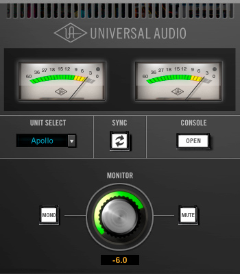
PS: It is a bit surreal, but I think this theme will compliment my new UA Apollo software console quite nicely on my desktop! 
Last edited by billybk1; 07-06-2012 at 07:17 AM.
|
|
|
|
|
07-13-2012, 08:19 AM
|
#65
|
|
Human being with feelings
Join Date: May 2010
Posts: 74
|
Albert, are you going to make this into a full theme? It looks awesome, very consoley, and is my favorite of your work so far. What will it be called and when can we get our hands on it? Keep up the great work!
|
|
|
|
|
07-13-2012, 08:53 AM
|
#66
|
|
Human being with feelings
Join Date: Mar 2012
Location: Bath, UK
Posts: 215
|
It looks brilliant! will it be smaller screen / laptop friendly?
|
|
|
|
|
07-13-2012, 10:17 AM
|
#67
|
|
Human being with feelings
Join Date: Jun 2008
Location: Whales, UK
Posts: 6,010
|
I like this, kind of 'soft touch' look knobs..
so has anyone 'knobbed up'  - the default theme yet?
something tasteful but cool?
i thought there would posts galore on release of
'default with knobs mods' but i've only see folk going alone and keeping them to themselves..
do share...
|
|
|
|
|
07-13-2012, 01:49 PM
|
#68
|
|
Human being with feelings
Join Date: Aug 2007
Location: Near Cambridge UK and Near Questembert, France
Posts: 22,754
|
Albert - I now HAVE my bigger monitor and find that the FX bins above the mixer strips are all to dark and with too little contrast between strips and labels for them to be easy to see.
Maybe make the background lighter so they show up better?
Please???
Or at least tell me how I can change the colour slightly in Walter?
|
|
|
|
|
07-21-2012, 06:56 PM
|
#69
|
|
Human being with feelings
Join Date: Jul 2012
Posts: 2
|
 Complete??
Hey guys! First of all this theme looks totally AMAZING!!!
I just wanted to know: is this theme complete (if so where can I download it?) or is it still work in progress?
I look forward to applying this to Reaper. Its so good it looks like its gonna end up being permanent!
|
|
|
|
|
07-30-2012, 12:02 PM
|
#70
|
|
Human being with feelings
Join Date: Nov 2010
Posts: 471
|
I really like this, too. But I think the illumination of the knobs should be as follows:
Volume: Just like you have now
Pan: Single light point following the knob as you had it before
Width: Like ED described

Everything else looks great.
|
|
|
|
| Thread Tools |
|
|
| Display Modes |
 Linear Mode Linear Mode
|
 Posting Rules
|
You may not post new threads
You may not post replies
You may not post attachments
You may not edit your posts
HTML code is Off
|
|
|
All times are GMT -7. The time now is 08:32 AM.
|


