 |
|

|
 12-29-2010, 07:14 AM
|
#321
|
|
Human being with feelings
Join Date: Nov 2009
Location: Perth, W.A.
Posts: 1,708
|
Quote:
Originally Posted by arkima

Hi Amazed,
Afaik we don't have any control over the appearance for this in the ME to match how it looks in the arrange. Color settings can help, but unless it has been changed since last I've used the Theme editor in Prefs - it may share color settings with the ruler/time lines foreground (numbers and indents etc).
Hopefully there is a way - I'd love to have it looking more matching and a bit easier looking to spot and grab...
-a
|
Thanks for that.
|

|

|
|
12-29-2010, 02:33 PM
|
#322
|
|
Human being with feelings
Join Date: Mar 2007
Location: Vancouver
Posts: 2,279
|
Quote:
Originally Posted by blueskies
|
Well done. It's great to see a working version of this up and running.
Shane
__________________
"Music should be performed by the musician not by the engineer."
Michael Wagener 25th July 2005, 02:59 PM
|
|
|
|
|
12-29-2010, 03:03 PM
|
#323
|
|
Human being with feelings
Join Date: Aug 2007
Location: france
Posts: 354
|

Quote:
Originally Posted by blueskies
Using Brice's december 23rd design I made a first attempt to Walter the Octave theme: download here: http://www.box.net/shared/vtertx8piq
All layouts in the mixer are basically working except the short mixer layouts that haven't been coded. The rest of the theme is still default V4. To use the theme, pls turn off "show pan controls at top" in the mixer, otherwise it looks kind of funny. Most of Brice's layout could be waltered, some things I have not been able to do, maybe can't be done yet, maybe they can and I just don't know how. A list of problem areas:
-The green color of the track id is hard-coded in the png file, track color only changes the label window not the id window.. if this can't be changed by user perhaps another color would be best.
-The two types of color text for the FX parameter knobs, can only be one color as far as I could see (must be a FR.. the two color feature looks great)
-The value displays of pan and volume are in the mcp_bg.png so pink "anti-stretch" lines had to be drawn, this fixates the height of the mixer panel below the fx and sends (except off course for the maximum height, extended and bit meter layouts as they have no sends/fx on top).. Maybe the value displays can be attached to the pan background in some cases or the volume display can be coded as an overlay of the phase button to alow stretching of the main fader area. I haven't tried that.
-When collapsing the transport bar downwards upto reaching minimal panel state, the green id on top is not aligned when using multiple layouts in same mixer window, there is a gap between some id headers and the transport bar. Funny, this gap is larger in the alfav19 than it was in alfav18.. Have no clue how to solve it so it looks nice, have a feeling it must be possible.. don't know how yet..
-Main mixer looks chaotic.. it is because it hasn't been waltered yet.. oops. Maybe Brice can make a nice master mixer layout??
Furthermore there are many small cosmetic errors that can be fixed, like some buttons if pressed show the V4 default buttons as no active state has been defined in the theme so far. Some buttons and backgrounds look stretched because I didn't bother at the moment looking at pink-lines possibilities for some or take directly the different size buttons from other layouts and put them in the corresponding layout directory. Also the volume faders and pan buttons look rough that is because in The psd file they were attached to the background and there weren't separate fader images that could be used.. so some shadings are wrong etc... Also I think the sends look too crowded.. maybe it's some alignment issue in the pngs I created. Many fonts have white color, they are too bright.. didn't bother with looking for nicer shade at the moment.
All in all has been some tough work to get to this.. but it's fantastic to see what can be done with Walter! hope someone can take it further from here. |
amazing work blueskies,
was gone for 3 days, what a nice surprise to see the theme taking shape.
- yeah the track color trick would be to use a transparent id png and use an extended label png
- ... will have to read the rest of your post later,
but yeah the two colors for the fx parameter ain't possible 'yet' (pretty please)
|
|
|
|
|
12-29-2010, 03:14 PM
|
#324
|
|
Human being with feelings
Join Date: Mar 2007
Location: Vancouver
Posts: 2,279
|
Just some additional feedback, which I'm sure you're already aware of. The solo and mute buttons dont visually indicate the state that they're in. The phase button shrinks to half size when enabled. That said, it's great to see this at it's next level, so a big well done to you blueskies.
Shane
__________________
"Music should be performed by the musician not by the engineer."
Michael Wagener 25th July 2005, 02:59 PM
|
|
|
|
|
12-29-2010, 03:51 PM
|
#325
|
|
Human being with feelings
Join Date: Nov 2006
Posts: 2,182
|
Quote:
Originally Posted by pixeltarian
hows about this one:
or
a weight indicator. or do you absoultely neeeeeeeeEEEEEDDDD actual plus and minus symbols?
... |
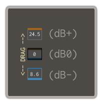
And speaking of the drag-able numbers: it would be great, if we could get different "drag speeds" depending on which position is the number you drag I mean, we have up to four positions: [xx.xx]
|
|
|
|
|
12-30-2010, 02:17 AM
|
#326
|
|
Human being with feelings
Join Date: Dec 2010
Posts: 3,826
|
You can do dragable numbers instead of the vol/pan sliders.
I have already done it on my theme 
|

|
|
|
12-30-2010, 02:21 AM
|
#327
|
|
Human being with feelings
Join Date: Apr 2010
Posts: 2,860
|
Quote:
Originally Posted by gpunk_w
You can do dragable numbers instead of the vol/pan sliders.
I have already done it on my theme |
really? how?
|
|
|
|
|
12-30-2010, 02:22 AM
|
#328
|
|
Human being with feelings
Join Date: Dec 2010
Posts: 3,826
|
Erm make an invisible vol or pan .png and place it over the vol or pan readout.
Now you can scroll left and right over the number or use mousewheel.
Or right click for text entry.
Simple really.
|
|
|
|
|
12-30-2010, 02:23 AM
|
#329
|
|
Human being with feelings
Join Date: Apr 2010
Posts: 2,860
|
Quote:
Originally Posted by gpunk_w
Erm make an invisible vol or pan .png and place it over the vol or pan readout.
Now you can scroll left and right over the number or use mousewheel.
Or right click for text entry.
Simple really.
|
Oh, duh, thanks!
|
|
|
|
|
01-06-2011, 06:52 AM
|
#330
|
|
Human being with feelings
Join Date: Dec 2010
Posts: 333
|
Anything new on OCTAVE?
|
|
|
|
|
01-06-2011, 08:31 AM
|
#331
|
|
Human being with feelings
Join Date: Dec 2010
Posts: 27
|
New waltered version of Brice's dec 23rd mcp mockup: http://www.box.net/shared/2pbxlllkc6
Fixed some issues discussed earlier (notably the track id coloring, now works as intended using Brice's trick).
Implemented also the short mixer layouts when resizing:
1) large vertical size has sends/param knobs/FX
2) decreasing vertical size collapses all tracks to be without fx and sends, while still retaining vertical volume faders. Nicely aligned track id's
3) Further collapsing vertical size, the mixer layout becomes the short mixer with horizontal vu meters and volume knobs.. cool!
other beauty issues of earlier post remain, just improved the walter coding
|
|
|
|
|
01-06-2011, 09:33 AM
|
#332
|
|
Human being with feelings
Join Date: Jun 2007
Location: By The Sea
Posts: 2,238
|
Quote:
Originally Posted by blueskies
New waltered version of Brice's dec 23rd mcp mockup: http://www.box.net/shared/2pbxlllkc6
Fixed some issues discussed earlier (notably the track id coloring, now works as intended using Brice's trick).
Implemented also the short mixer layouts when resizing:
1) large vertical size has sends/param knobs/FX
2) decreasing vertical size collapses all tracks to be without fx and sends, while still retaining vertical volume faders. Nicely aligned track id's
3) Further collapsing vertical size, the mixer layout becomes the short mixer with horizontal vu meters and volume knobs.. cool!
other beauty issues of earlier post remain, just improved the walter coding |
Does this work with V4 apha24?
|
|
|
|
|
01-06-2011, 11:32 AM
|
#333
|
|
Human being with feelings
Join Date: Dec 2010
Posts: 27
|
Yes should work, tested it on Windows with alfa_v24
Only the mixer track panels have been done. Master mixer track panel and other gui elements are still messy, they have not been worked on yet
|
|
|
|
|
01-07-2011, 02:02 AM
|
#334
|
|
Human being with feelings
Join Date: Mar 2010
Location: France
Posts: 459
|
Quote:
Originally Posted by blueskies
Yes should work, tested it on Windows with alfa_v24
Only the mixer track panels have been done. Master mixer track panel and other gui elements are still messy, they have not been worked on yet
|
Thank you!
|
|
|
|
|
01-07-2011, 07:36 AM
|
#335
|
|
Human being with feelings
Join Date: May 2007
Location: Cape Town
Posts: 327
|
Thank you to all involved, this theme is looking pretty fine so far
|
|
|
|
|
01-07-2011, 08:12 AM
|
#336
|
|
Human being with feelings
Join Date: Aug 2007
Location: france
Posts: 354
|
great work blueskies, I need to find some free time and work on the TCP and various button states.
I'll try and get some stuff done over the week-end.
The tiny mixer height is lovely
track coloring working
|
|
|
|
|
01-07-2011, 08:23 AM
|
#337
|
|
Human being with feelings
Join Date: Oct 2010
Location: Oxford, UK
Posts: 99
|
Keep it up guys. Excellent work. Wish I had the skills to help out.
|
|
|
|
|
01-07-2011, 09:47 AM
|
#338
|
|
Human being with feelings
Join Date: Dec 2010
Posts: 27
|
Brice, I had to place the knobs in the tiny mixer layouts to the right of the volume display field, cause I couldn't think of a way to change the volume display field when resizing as it is "hard coded" into the png of the mcp_bg. Tried to think of workarounds to get it done, but haven't found one.
So I took the liberty of shifting the knobs to the right for the moment, still looks pretty nice!
|
|
|
|
|
01-07-2011, 09:53 AM
|
#339
|
|
Human being with feelings
Join Date: Aug 2007
Location: france
Posts: 354
|
yup noticed that, that's fine,
the volume value and background png jump a bit to the left though, could it stay in place?
|
|
|
|
|
01-08-2011, 06:30 AM
|
#340
|
|
Human being with feelings
Join Date: Dec 2010
Posts: 27
|
keen eyes! Yes, the volume label text is normaly centered in the display field, but left aligned with less margin for the small size mixer to prevent the B from "dB" overlapping the knob for + volumes. There is a jump there
Will play some more with it to see what can be done.
|
|
|
|
|
01-08-2011, 01:57 PM
|
#341
|
|
Human being with feelings
Join Date: Jan 2008
Location: Vancouver, BC
Posts: 3,795
|
I've been using the version blueskies posted for the last day and have a few thoughts. Some may be known issues, and others due to the WALTERing still being in it's initial stages, but here goes:
- If the Pan and [Automation + IO + FX] traded places, I'd have to move my mouse a lot less. Pan is something I usually set once per track, whereas automation and FX get used more frequently, and would be better closer to the arrange window in my opinion.
- It's often hard to tell if the track is muted because the text is hard to see at a glance.
- The VU is a bit hard to read (not enough contrast between the meter and its background)
- I'm finding it a bit awkward finding enough blank space to select tracks. This could just take some getting used to.
- A few things are weirdly stretched, specifically the master fader (known issue).
Aside from that, it looks and feels great (especially when you start coloring tracks). This will definitely be my new theme when it's done. Keep up the great work guys! 
__________________
FRs: v5 Media Explorer Requests, Global Quantization, Session View
Win10 Pro 64-bit, Reaper 6(x64), AMD 3950x, Aorus X570 Master, 64GB DDR4 3600, PowerColor Red Devil 5700XT, EVO 970 2TB, 10TB HD, Define R6
|
|
|
|
|
01-10-2011, 01:55 AM
|
#342
|
|
Human being with feelings
Join Date: May 2007
Posts: 88
|
Guys Thanks for all your effort!
When sizing down the Track Panel, i think it would be very handy if the controls would go to knobs too like they do when you size down the Mixer Panel...
Joe
|
|
|
|
|
01-10-2011, 08:15 PM
|
#343
|
|
Human being with feelings
Join Date: Jul 2010
Location: Cali, Colombia.
Posts: 630
|
What happened to the layout of the TCP? this is a great theme project we are all expecting to see released. Come on keep the hard work.
Thank
Ed.
|
|
|
|
|
01-11-2011, 09:19 AM
|
#344
|
|
Human being with feelings
Join Date: Feb 2008
Location: Moon
Posts: 112
|
This theme is in my opinion good for:
-scheme colors (good for eyes).
But almost every Reaper theme fail for that "flat sensation" that tend to distract the eyes and makes you think all the elements like faders, buttons is bombarding you and that tired you. Perhaps a little more emboss feel is what this theme "begs" for. No ofense, I speak with much respect for Brice (a very talented person IMO) and with much respect for all members involved in Reaper development. Look to every other DAW on a market, some of them are so simple and clearer because every graphic element is on the right spot. Too much colors distract. To much white kill the eyes. Too much elements without embossed feel looks more like a diagram to me, not like a 2011 DAW interface. Every element must give you the feel that it exists and is nothing like a pattern. Again, emboss my friends, done with love and cautions can be the great missing secret for doing the most sensational theme for my eternal friend (and that is Reaper).
So think like this:
when you mix, the name of the track is what matters most. This must be the most distinct element, but not in a "fancy" way, nothing in a fancy way, this ruins a theme from the first look.
Too much colors looks ugly and like it's done by the amateurs. Avoid "the sticky tracks sensation" (another aspect that driving me crazy). Not even in this theme I don't have the feel that one track is individual from another. Again, emboss (with style, not brutal!!!!!), or at list make another type of border, something to tell me "this is not tetris, this is serious" I don't know... I smell the success here that is why I posted, and dark theme (with Brice style) is the way to go. Not that dark to uniform things in the daylight, not that light to kill people in the moonlight. I know it's hard, but I put my trust on you. I wait for the day when Muad'Dib of Reaper GUI will save us from a long pain. Maybe he is already here with us. Step in the light...
Last edited by Avatar44; 01-11-2011 at 11:36 AM.
|
|
|
|
|
01-11-2011, 02:14 PM
|
#345
|
|
Human being with feelings
Join Date: Jul 2010
Location: Cali, Colombia.
Posts: 630
|
Quote:
Originally Posted by Avatar44
This theme is in my opinion good for:
-scheme colors (good for eyes).
But almost every Reaper theme fail for that "flat sensation" that tend to distract the eyes and makes you think all the elements like faders, buttons is bombarding you and that tired you. Perhaps a little more emboss feel is what this theme "begs" for. No ofense, I speak with much respect for Brice (a very talented person IMO) and with much respect for all members involved in Reaper development. Look to every other DAW on a market, some of them are so simple and clearer because every graphic element is on the right spot. Too much colors distract. To much white kill the eyes. Too much elements without embossed feel looks more like a diagram to me, not like a 2011 DAW interface. Every element must give you the feel that it exists and is nothing like a pattern. Again, emboss my friends, done with love and cautions can be the great missing secret for doing the most sensational theme for my eternal friend (and that is Reaper).
So think like this:
when you mix, the name of the track is what matters most. This must be the most distinct element, but not in a "fancy" way, nothing in a fancy way, this ruins a theme from the first look.
Too much colors looks ugly and like it's done by the amateurs. Avoid "the sticky tracks sensation" (another aspect that driving me crazy). Not even in this theme I don't have the feel that one track is individual from another. Again, emboss (with style, not brutal!!!!!), or at list make another type of border, something to tell me "this is not tetris, this is serious" I don't know... I smell the success here that is why I posted, and dark theme (with Brice style) is the way to go. Not that dark to uniform things in the daylight, not that light to kill people in the moonlight. I know it's hard, but I put my trust on you. I wait for the day when Muad'Dib of Reaper GUI will save us from a long pain. Maybe he is already here with us. Step in the light...
|
100% agree!!!
|
|
|
|
|
01-11-2011, 03:06 PM
|
#346
|
|
Human being with feelings
Join Date: Dec 2008
Posts: 535
|
Quote:
Originally Posted by Avatar44
This theme is in my opinion good for:
-scheme colors (good for eyes).
But almost every Reaper theme fail for that "flat sensation" that tend to distract the eyes and makes you think all the elements like faders, buttons is bombarding you and that tired you. Perhaps a little more emboss feel is what this theme "begs" for. No ofense, I speak with much respect for Brice (a very talented person IMO) and with much respect for all members involved in Reaper development. Look to every other DAW on a market, some of them are so simple and clearer because every graphic element is on the right spot. Too much colors distract. To much white kill the eyes. Too much elements without embossed feel looks more like a diagram to me, not like a 2011 DAW interface. Every element must give you the feel that it exists and is nothing like a pattern. Again, emboss my friends, done with love and cautions can be the great missing secret for doing the most sensational theme for my eternal friend (and that is Reaper).
So think like this:
when you mix, the name of the track is what matters most. This must be the most distinct element, but not in a "fancy" way, nothing in a fancy way, this ruins a theme from the first look.
Too much colors looks ugly and like it's done by the amateurs. Avoid "the sticky tracks sensation" (another aspect that driving me crazy). Not even in this theme I don't have the feel that one track is individual from another. Again, emboss (with style, not brutal!!!!!), or at list make another type of border, something to tell me "this is not tetris, this is serious" I don't know... I smell the success here that is why I posted, and dark theme (with Brice style) is the way to go. Not that dark to uniform things in the daylight, not that light to kill people in the moonlight. I know it's hard, but I put my trust on you. I wait for the day when Muad'Dib of Reaper GUI will save us from a long pain. Maybe he is already here with us. Step in the light...
|
also +1
__________________
Producer | Engineer
Previous credits include:
BP Fallon, Emma Lou & The Agenda, The Hot Sprockets, Leaders Of Men, Travis Oaks
|
|
|
|
|
01-12-2011, 07:35 AM
|
#347
|
|
Human being with feelings
Join Date: Feb 2008
Location: Moon
Posts: 112
|


OK, I post yesterday and now, after a long night I try to "paint" in Photoshop something to help my point of view. This is my first attempt in such a direction. I don't know nothing about Reaper GUI- how it works etc- but I am a 2D artist from time to time. I can work with Adobe Photoshop to express myself.
I made this with care for Brice layout but I don't know if it's possible to be injected in Reaper as a theme. At least, I was trying to achieve, what a dark theme will suppose to look if a little shadow, emboss can be made. Now that I try, I can confirm that Reaper can be tricky in the theme sector. To much regular polygons that distract your creativity. It's like, "hey, a regular polygon, we must fill it with a regular polygon button". There are tons of buttons and if all of them are regular I almost hear the SID chip in my brain screaming "Tetris, I don't have too much time, where to put it, I'm loosing my score..." So, the specialists, must avoid this type of geometry when they build groups of icons like those from the bottom in my images IMO. The smoothness that came with embossed elements is something that Reaper is needing everyday. The GUI become articulate, those knife lines that splits tracks don't hurts our dark side of the moon fragile parts, and we can live in peace. I hope you will find something useful in my modest attempt.
Last edited by Avatar44; 01-12-2011 at 08:02 AM.
|
|
|
|
|
01-12-2011, 08:06 AM
|
#348
|
|
Human being with feelings
Join Date: Nov 2008
Location: Toronto, Canada
Posts: 4,630
|
Love it. 
|
|
|
|
|
01-12-2011, 08:07 AM
|
#349
|
|
Human being with feelings
Join Date: Nov 2009
Location: Switzerland
Posts: 14
|
hm, I don't want to be boorish, but i don't get the point to change a lot of the graphical elements in octave... I like the style of brice's work very much and I would be disappointed if this theme change its direction.
Wouldn't it be better to start a second theme for this goal?
|
|
|
|
|
01-12-2011, 08:08 AM
|
#350
|
|
Human being with feelings
Join Date: Dec 2008
Posts: 535
|
i agree. too much of a detour from what is already looking like a lovely theme. BUT a few of your ideas regarding style should definitly be implemented.
__________________
Producer | Engineer
Previous credits include:
BP Fallon, Emma Lou & The Agenda, The Hot Sprockets, Leaders Of Men, Travis Oaks
|
|
|
|
|
01-12-2011, 08:13 AM
|
#351
|
|
Human being with feelings
Join Date: Mar 2010
Location: the woods, Arkansas
Posts: 1,063
|
Quote:
Originally Posted by flowbot
hm, I don't want to be boorish, but i don't get the point to change a lot of the graphical elements in octave... I like the style of brice's work very much and I would be disappointed if this theme change its direction.
Wouldn't it be better to start a second theme for this goal?
|
I don't know, but I am now interested.
I originally loved brice's mock up pre v4 alpha. but as a layout, not for it's colors. this one looks so much better.
But they are both good.
cant you have an
octave emerald
octave gold
etc.
some themes have multiple versions.
|
|
|
|
|
01-12-2011, 08:17 AM
|
#352
|
|
Human being with feelings
Join Date: Nov 2008
Location: Toronto, Canada
Posts: 4,630
|
It's a Reaper custom for a good theme to become the basis for other people's innovations. I think it's good to see that there will be at least two excellent themes that may come from this thread. But obviously we should get the original in working order first.
|
|
|
|
|
01-12-2011, 08:23 AM
|
#353
|
|
Human being with feelings
Join Date: Mar 2010
Posts: 176
|
I have to say that Avatar44`s mockup looks really nice. Not to say the original is bad, - I really like that too. But to this day imo this is the most-easy-to-read and easy on the eye version I´ve seen. (Agree, - I too am not to fond of the green color ...).
Hope someone with Walter-knowledge will try to give a go on this theme too.
__________________
iMac 27" 3.05 GHz/8 GB Ram, LaCie ex. FW400/800 HD´s, OS 10.6.8, Mackie 400F, Reaper, Logic 8.0.2 & Studio One
|
|
|
|
|
01-12-2011, 08:24 AM
|
#354
|
|
Human being with feelings
Join Date: Mar 2010
Location: the woods, Arkansas
Posts: 1,063
|
Quote:
Originally Posted by Kundalinguist
It's a Reaper custom for a good theme to become the basis for other people's innovations. I think it's good to see that there will be at least two excellent themes that may come from this thread. But obviously we should get the original in working order first.
|
fair enough.
|
|
|
|
|
01-12-2011, 08:30 AM
|
#355
|
|
Human being with feelings
Join Date: Feb 2008
Location: Moon
Posts: 112
|
Quote:
Originally Posted by flowbot
hm, I don't want to be boorish, but i don't get the point to change a lot of the graphical elements in octave... I like the style of brice's work very much and I would be disappointed if this theme change its direction.
Wouldn't it be better to start a second theme for this goal?
|
I don't know how. As I already said it, I don't know nothing about how to implement this theme in Reaper, this is just Photoshop and me retouching with some ideas about this layout. I don't want to detour. I want to improve if it's possible, Open Community Theme is in the title of this thread. Maybe I'm wrong, as I see now, you wait for a specific theme and is nothing to be improved here. Fine, if you ask me. Looks like some good themes will be seen in the future!
|
|
|
|
|
01-12-2011, 08:37 AM
|
#356
|
|
Human being with feelings
Join Date: Feb 2008
Location: Eesti
Posts: 2,721
|
I like the original flat look, so I hope this doesn't get diluted.
|
|
|
|
|
01-12-2011, 08:39 AM
|
#357
|
|
Human being with feelings
Join Date: Jul 2009
Posts: 633
|
Please make this a new different theme.
I really like Brice's theme and this one is really not my taste in anyway.
|
|
|
|
|
01-12-2011, 08:41 AM
|
#358
|
|
Human being with feelings
Join Date: Nov 2009
Location: Switzerland
Posts: 14
|
Nonono, you misunderstand me! I didn't want to criticize your work, I have big respect for everyone who put his ideas to the whole thing. My point was only to suggest developing both styles/graphic sets. This is a open thing and that's good!
cheers & sorry
|
|
|
|
|
01-12-2011, 08:56 AM
|
#359
|
|
Human being with feelings
Join Date: Feb 2008
Location: Moon
Posts: 112
|
Quote:
Originally Posted by flowbot
Nonono, you misunderstand me! I didn't want to criticize your work, I have big respect for everyone who put his ideas to the whole thing. My point was only to suggest developing both styles/graphic sets. This is a open thing and that's good!
cheers & sorry
|
I cannot be upset on you. You have such a nice avatar...
Quote:
Originally Posted by caseyjames
Please make this a new different theme.
I really like Brice's theme and this one is really not my taste in anyway.
|
I will force you to taste this in all the possible ways, I will lock all Reaper themes in the world and leave you just this. to torture your soul.
Last edited by Avatar44; 01-12-2011 at 09:08 AM.
|
|
|
|
|
01-12-2011, 08:57 AM
|
#360
|
|
Human being with feelings
Join Date: Nov 2009
Location: Switzerland
Posts: 14
|
hehe...thx ;-)
|
|
|
|
| Thread Tools |
|
|
| Display Modes |
 Linear Mode Linear Mode
|
 Posting Rules
|
You may not post new threads
You may not post replies
You may not post attachments
You may not edit your posts
HTML code is Off
|
|
|
All times are GMT -7. The time now is 03:40 AM.
|


